remendous Marketing
Solutions for professional website design and development
Long Course Weekend

Data
- Title: Long Course Weekend
- Categories: Logo Design.
- Year: 2013
Description
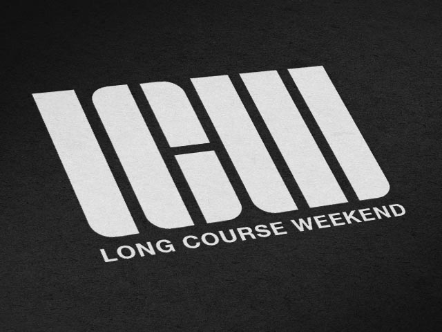
After the Long Course Weekend secured television broadcasting for the 2013 event, they wanted a brand which looked slicker and more memorable and help to enhance the events image.
Being that the events big selling point is that it is the only triathlon in the UK done over 3 days, we wanted to make that a big influence in the design. This lead to the use of groups of lines within the logo. The letters LCW are represented by curved edges within the shape, with each letter gradually increasing in the number of lines it uses; for example the letter L uses one line to represent the first day, the letter C uses two lines and so on.
We used black and white within the design because it gives the most impact. This is something people will see as the pass an advertising board or on someones training top, so it needed to be eye catching. This is also very marketable without the word beneath it, so it can be used as it is on clothing for athletes.


