remendous Marketing
Solutions for professional website design and development
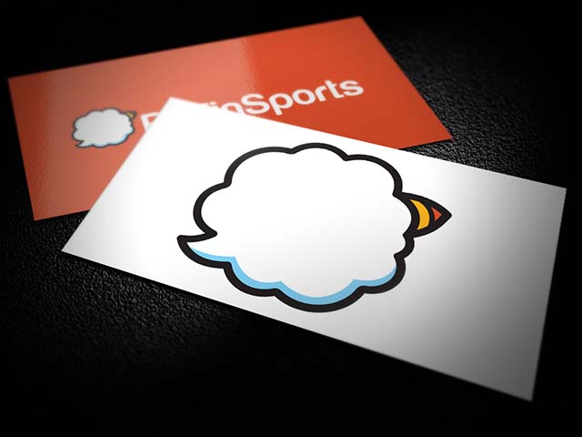
Puffin Sports
Data
- Title: the title item
- Categories: Logo Design, Print, Web Design, Ecommerce
- Year: 2014
Description
As a rebrand for a sports equipment stockist, the clients wanted something which stood out from everything else and portrayed a sense of fun, but was still serious. They had the name puffin sports, and wanted to play along the idea of not just the Puffin bird, but also Puffin, as in being out of breath during exercise or sport.
To portray both these variations of the word, I used a cloud shape to represent the steam that leaves a persons mouth, while the flick not only showed it was leaving someones mouth, but also doubled up as the puffins tail. A vibrant beak at the other side of the shape shows the bird has an influence in the name.
The final touch to it was the tittle of the letter I being orange, and following a similar shape as a puffins beak, to add a little bit of colour into the text, but also create another hidden identity within the text of a puffin shape.
Related Works